
Hello Friends!
It's been awhile. I hope you don't mind that I took the summer off to spend time with the kiddos. To Studly's chagrin, projects are back in full force. I can't wait to show you my most recent endeavor...the upstairs bathroom. It's a tricky little spot because it doubles as both the kids bath and the guest/company bathroom. I've had a good time trying to make it fun and whimsical for the kiddos but also sophisticated enough for any visitors. And unlike our last bathroom reno, this one was all DIY...as in, I did almost all of work myself. It's not quite complete, but should be finished within the next week or two. I can't wait to show you the final product.
In the meantime, I was contacted by Zillow to host a post. If you aren't familiar with Zillow, it is an online real estate data base that provides information and tools for the average joe like you and me, to make smart and educated decisions about homes and real estate, etc. The've also got a fantastic link that provides oodles of ideas and inspiration for whatever home improvement project you are working on. It's definitely worth checking out.
If you are considering updating a room or doing a complete reno, this post has some valuable information on choosing the right color. What I liked most is that while most of the color suggestions are ver current and very in, they are also very classic and will stand the test of time. So, without further ado, I turn the time over to Jennifer Riner. Thanks Jennifer.
And, I'll see you back here soon with my bathroom reveal and some other good stuff!
5 Colors that
Optimize Living Spaces
By Jennifer Riner of Zillow
Homeowners strive to optimize the size and layouts of the
rooms in their homes to use their spaces at their fullest potential with the
greatest possible luxury. However, some colors and styles ruin a space’s design
with overly ornate, bright or distracting finishes. Living space designs require
extra caution, as homeowners must appeal to residents, guests and future
homebuyers.
Remaining stylish yet neutral can be complicated. Rather
than selecting safe, bland beige, consider the following five hues for chic living
rooms.
1. Dark Gray

Source: Highlight Builders
Charcoal tones are trending in the design world because they
warm interiors without appearing gaudy. Beige is the previously trendy warm neutral
that’s now considered “builder-grade” and dated, particularly due to its prominence
in homes for sale throughout
the United States. When painting with gray tones, purchase flat paint instead
of semi- or high-gloss alternatives to avoid overly shiny and metallic walls.
Further, consider cream-colored trim rather than stark molding for a softer
contrast. Additionally, avoid overhead fixtures as they tend to cast shadows on
walls creating darker spaces. Multi-level freestanding lights brighten up dark
gray walls suitably.
2. Bright White
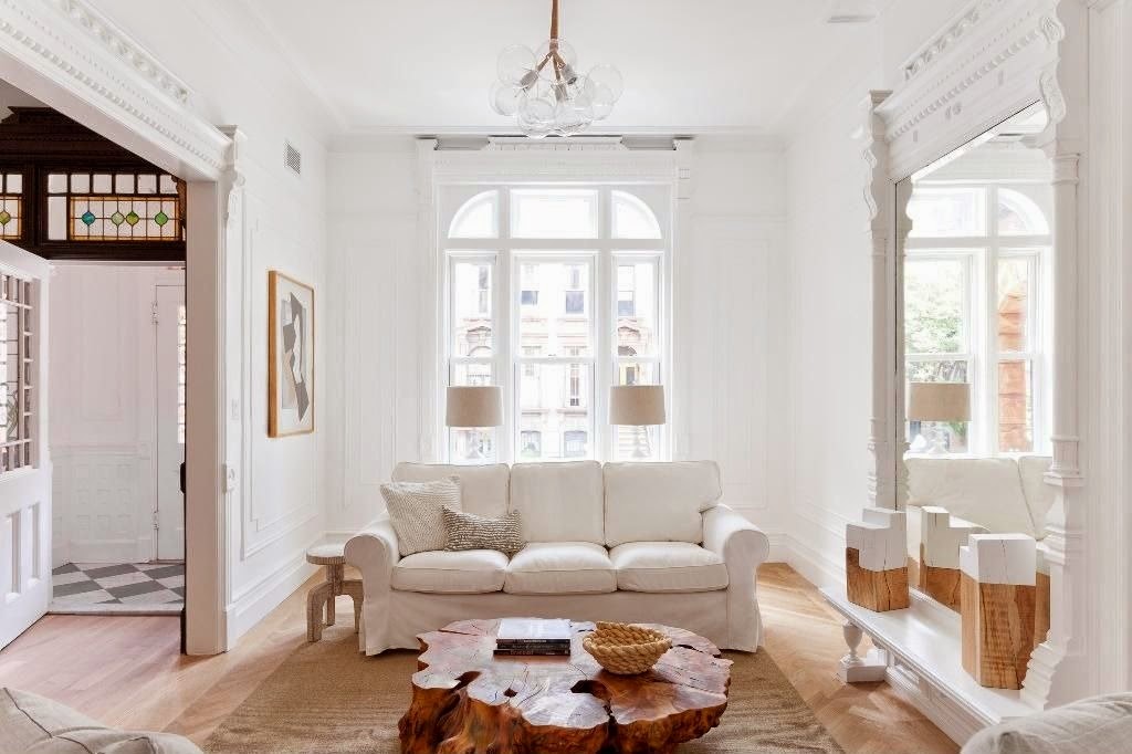
Source: Zillow
White seems like an easy go-to wall color, but selecting unique,
elegant shades of white is tricky. Designers and homeowners have hundreds of
white paint possibilities ranging from elegant to standard white. Some of the
most popular preferences include Benjamin Moore’s “Linen White,”
Sherwin-Williams’ “Dover White” and Valspar’s “Du Jour.” Sticking to neutral
color palettes is always beneficial, especially when residences aren’t fully
furnished quite yet. Further, white paint has widespread appeal and won’t deter
homebuyers in the future.
3. Deep Blue

Source: Paola McDonald
Navy blue is a strong hue
that adds stateliness to interiors. It’s best to let it stand on it’s own or
with a few other complementary shades, such as white or yellow. For a nautical
vibe, incorporate navy and white as chief colors and showcase reclaimed wood
furnishings and wall décor. If dark blue is too intimidating as wall paint, use
it as an accent color for furnishings and keep the walls a neutral, light gray
or white. More advanced designers might paint the ceiling a plain or patterned
blue hue for enhanced visual interest.
4. Soft Yellow
Source: The Corcoran Group
Homeowners sometimes shy away from yellow in their living
spaces, escaping the stereotypical overly bright, tacky and overwhelming
designs. Soft yellows, though, are great for adding vibrancy and flair to any
room – especially where socialization is key. Yellow is surprisingly versatile
and can match existing color schemes easily, so complete redesigns aren’t
necessary. Complementary colors include blue, green, light brown and black, all
used in moderation.
5. Accent Red

Source: DAS Studio
Most homeowners won’t dare paint their entire homes red –
and rightfully so, as red overwhelms small spaces and intimidates guests.
Rather than omit altogether, use red in moderation. Paint built-in bookshelves
a bright red hue to cover one wall of a living space. Or, sew a few throw
pillow covers with fun red fabrics to display throughout the room. Red is bold
and energizes interiors if applied in small amounts. Focus red on either one
wall or a few accents to avoid completely overpowering interior design schemes.
Selecting suitable wall colors is never an easy process, but
luckily mistakes can be remedied with primer and fresh coats of paint. Experiment
wisely, as multiple layers can ultimately waste valuable time, money and
energy.

No comments:
Post a Comment
I love it when people leave comments, but please keep your spam to yourself. Spam scares me.